Scatter Diagram Method
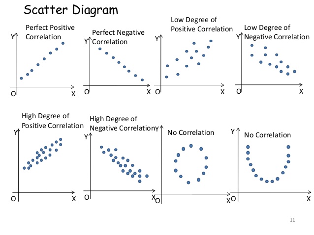
Scatter Diagram Method is the simplest method of studying the correlation between two variables. In this method, the values of one of the variables are represented by X-axis and the other variables are represented by Y-axis. Then for each pair of the values of the variables a dot is plotted which gives an indication of the direction of the diagram.
The scatter of points on the graph gives an idea of whether the variables are related or not. When the dots are more scattered then the degree of relation between two variables is very less. The closer the dots near the straight line more will be the association between the variables. If all the points lie on a straight line falling from the lower left-hand corner to the upper right-hand corner, then the correlation is said to be perfectly positive. If all the points are lying on a straight line rising from the upper left-hand corner to the lower right-hand corner of the diagram, then the correlation is said to be perfectly negative. If the points fall in a narrow band, there will be a high degree of correlation between the variables.
Correlation will be positive if the points are in increasing tendency from the lower hand corner to the upper right hand corner and negative if the points show a declining tendency from upper left hand corner to the lower right hand corner.

Correlation |
Karl Pearson’s Coefficient |


